Working on the website of a Maintenance Outfit posed certain unique challenges and overcoming them added enormous value to my experience as a web designer.
What is the business about?
This Maintenance business is a company based in Cardiff. It provides total building maintenance services and boasts of a client base that includes hotel chains, retail outlets, large office blocks, nursing homes, industrial units, factories, football stadiums, leisure centres, hospitals and many others. In the eight years since its establishment, the company has grown tremendously and was named the 26th fastest growing company in Wales in the year 2011. The company has now expanded to Bristol region as well.
Target audience
The target audiences of my client are businesses and service organisations, as mentioned above.
Challenge
The nature of business was a challenge because a website of this nature needs to imply a very high level of efficiency, professionalism, meticulousness and a no-nonsense image. The second challenge was to make it appealing to its diverse customer base.
Overcoming challenges
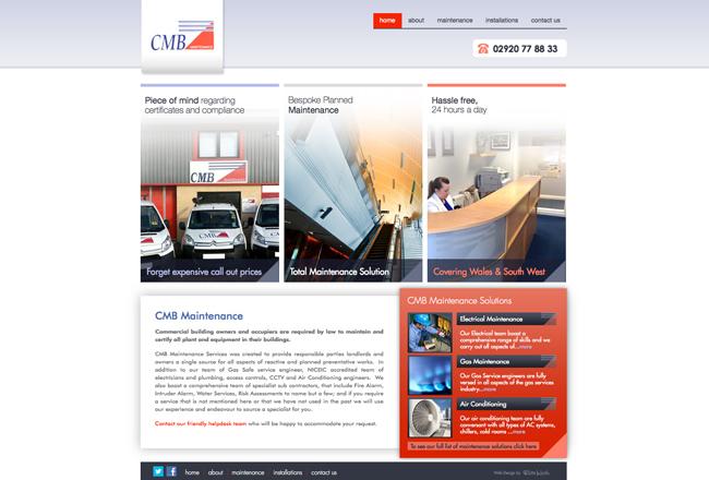
When customers visit a website of a business of this nature, they expect to see professionalism. They have no time for unnecessary frills that only add visual value to the website. Therefore, I chose a neat and clean layout with white and grey background highlighted by dark orange.
Grey is a stabilising colour and when used strategically, it makes the web page look formal, elegant, dependable and mature. White enhances these characteristics while simultaneously negating the drawbacks of grey because too much of grey can make the page look depressing. In order to add a dash of colour to the neutral colour theme, I used dark orange/red, a colour that indicates passion, aggression, determination and stimulation.
The colour theme remains constant in all the pages of the website. In fact, if you notice closely, I have used pictures that predominantly have these colours so as to make the website look very well coordinated and consistent. Although a visitor might not notice the matching colour theme, it does contribute tremendously to the overall homogeneity of the website and enhances its professional appeal.
Having established the colour theme, the next important consideration was the layout of the page. As you can see in the website, the layout of the home page is very simple, short and offers maximum information without having to scroll much at all. The objective of this presentation is to help visitors obtain information within a few seconds of their arrival on the page. Such a quality is crucial to business websites.
I have paid special attention to making the navigation very easy so that information is easy to get. In my experience, I have noticed that making information hard-to-get increases bounce rates tremendously in business websites.
Along with the home page, the website has five pages and each of these have sub pages. Each page provides detailed information about the respective heads. The website has several functional features such as content management system, drop down menu, custom slide show and contact form.
So, the choice of colours and the overall design of the website personify the ethics of my design client – a meticulous, dependable and professional company that moves forward with determination and passion.
https://www.rhyswelsh.com/about/blog/case-study-new-website-for-business-maintenance-co#sigProId1a6453b05d


