The Brief
The client had previously purchased the company and decided they were in need of a new look as the old website was targetting the wrong audience.
The Design
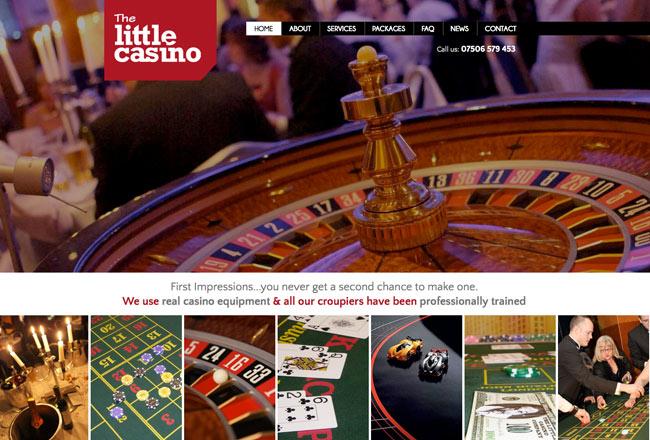
A concept was developed that aimed to evoke the excitement and allure of casinos. The design elements were carefully chosen to create an immersive and visually striking experience for visitors. The use of vibrant colors, dynamic graphics, and captivating imagery instantly grabbed the attention of users, enticing them to explore further.
One of the key features incorporated into the website design was a slideshow. This dynamic element allowed the Little Casino Company to showcase the various aspects of their services, including the range of games, the atmosphere of the casino, and the overall entertainment offered. The slideshow served as a powerful visual tool, effectively communicating the thrill and excitement that visitors could expect from engaging with the company.
In addition to the slideshow, drop-down menus were implemented to enhance navigation and accessibility. These menus provided a clear and organized structure, allowing users to easily explore different sections of the website and find the information they were seeking. By streamlining the user experience, the drop-down menus enhanced the overall usability of the website, ensuring that visitors could easily access the desired content.
https://www.rhyswelsh.com/about/blog/casino-company-project#sigProId5792710ba1
Testimonial
"I worked with Rhys to design a web site for our Fun Casino Company. I was keen to work with a local Cardiff designer and Rhys offered great advice and a personal level of service that stands him apart from many others. Traffic to our sight is continuing to increase and Rhys has even worked on making improvements after the launch. I will continue to work with Rhys on the developement of this and other sites in the future."


