The site design brief
Having had issues with their previous website company, a new concept was required to represent their business and evergrowing portfolio. Following the website the client required stationary designs ready for print.
The Final Product
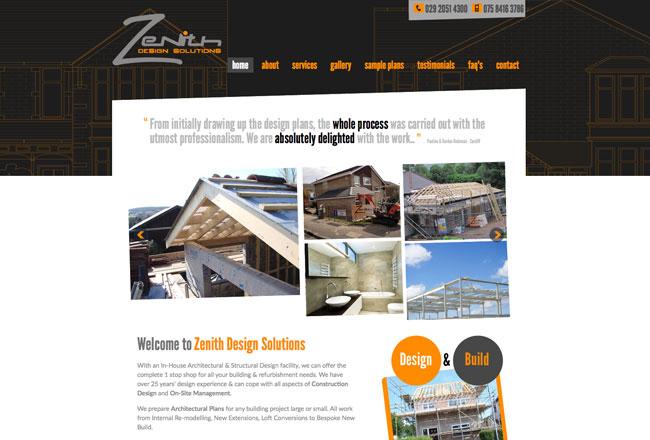
A new design concept was developed, incorporating an angled framework that evoked a "construction" style. This design choice aimed to visually convey the client's expertise and professionalism in their field. By integrating this architectural element into the overall layout, the website design exuded a sense of solidity and precision.
n alignment with the client's branding, strong and impactful colors were employed throughout the design. These colors not only helped establish a consistent and recognizable brand identity but also added vibrancy and visual interest to the website. By harmonizing the angled framework with the bold branding colors, the design achieved a cohesive and visually appealing aesthetic.
The final product of this design endeavor successfully addressed the client's concerns with their previous website. The new concept effectively represented the client's business and showcased their ever-growing portfolio. The incorporation of the angled framework, strong branding colors, and the thumbnail gallery created an engaging and visually appealing website. The addition of professionally designed stationary further reinforced the client's brand identity and provided a cohesive visual experience across both digital and print platforms.
https://www.rhyswelsh.com/about/blog/construction-website-design-project#sigProId1773df3569


