The Design Project
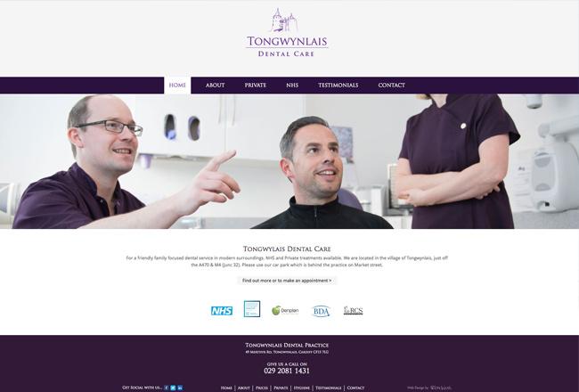
The client had a single page website and wanted to raise the profile of the business - especially as they were celebrating 10 years in business. The project started with a complete rebrand, and developed a new logo that uses the iconic Castle Coch outline, which was hand drawn.
Building upon the rebranding, the design project extended to the development of a new website. The website design seamlessly incorporated the client's existing brand colors, ensuring consistency and recognition. A key aspect of the website's design was the pursuit of a professional and polished appearance, which would enhance the client's credibility and convey a sense of trustworthiness to visitors.
One of the standout features of the website design was a full-screen slideshow. This dynamic element allowed the client to feature captivating images that captured the essence of their business and conveyed their unique selling points. The full-screen slideshow created a visually striking first impression, instantly grabbing the attention of visitors and encouraging them to explore further.
In addition to the slideshow, thumbnail galleries were integrated into the website design. These galleries served as organized collections of images, allowing visitors to easily navigate through different categories and explore specific aspects of the client's offerings. By presenting a visually appealing and user-friendly browsing experience, the thumbnail galleries facilitated a deeper engagement with the content and encouraged visitors to delve into the various facets of the business.
https://www.rhyswelsh.com/about/blog/dental-practice-logo-and-website#sigProIdb3f7137109


