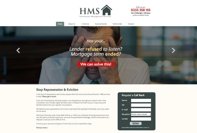
Having had a bad experience with previous website projects, I was approached to design a new website idea that the client required. The design was produced with a specific target audience in mind.
Features
The website uses call to actions to make it easy for users to get in contact quickly. A copywriter was brought in to enhance the text and free up time fro the client. A double column mega menu was created to enhance the drop down menu and usability.
One of the primary objectives was to make it effortless for users to contact the company for assistance. To achieve this, prominent call-to-action buttons were strategically placed throughout the website, ensuring that users could easily locate and engage with the necessary contact information. By streamlining the communication process, the website aimed to facilitate quick and efficient connections between the company and its clients.
Recognizing the importance of engaging and persuasive content, a professional copywriter was brought in to optimize the text on the website. This collaboration aimed to ensure that the messaging effectively conveyed the company's services, values, and expertise, while also maintaining a clear and concise tone. By employing the expertise of a copywriter, the client was able to save time and focus on other aspects of their business, while ensuring that the website's content was engaging and informative.
Furthermore, the website's navigation was enhanced through the creation of a double-column mega menu. This innovative menu design allowed for a more intuitive and organized browsing experience, particularly when navigating through a variety of services or informational sections. The double-column layout provided a clear and visually appealing dropdown menu, ensuring that users could easily explore different areas of the website and find the information they needed without any confusion or frustration.
In summary, the Swansea Eviction Help Specialists Company Design project aimed to deliver a user-friendly and engaging website that prioritized easy communication, persuasive content, and intuitive navigation. By incorporating call-to-action buttons, collaborating with a copywriter, and implementing a double-column mega menu, the website sought to provide a seamless and informative experience for its target audience, ultimately enhancing the company's online presence and accessibility.
https://www.rhyswelsh.com/about/blog/swansea-eviction-help-specialists-company-design#sigProId35026041d1


