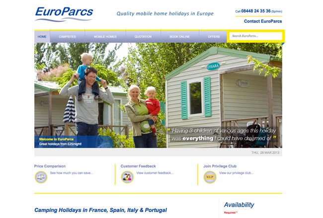
 A corporate website acts as a lighthouse for a company and its clients. Even with the intrusion of social media and blogs into the corporate world, a website is still considered as the first parameter to judge a company.
Whether self-designed or created by a web designer in Cardiff, the importance of a good corporate website far exceeds its apparent initial value. Not only is it a magnet for attracting new clients, it also exudes the functionality and efficiency of the corporation itself. Looking for the perfect recipe for a smashing corporate website? Here are few helpful roadmaps!
The theme
The very first point to swear by is that a corporate website represents a company, and NOT a specific department within it. It is okay to highlight your latest achievement/product in a small advertisement, but it is never a good idea to convert it into a marketing campaign and flood the front page with your inventory.
The front page should be simple, elegant, and contain a simple note to welcome the visitors and deliver a clear message about the vision and mission of the company. The company logo and the name should be strategically placed so that it is the first thing the visitors see on the website.
The audience
A good corporate website should ideally act like a crossroad, showing the path to various divisions. Always remember, not only clients, but a lot of other types of visitors, like job-seekers, investors and rivals, will visit your webpage. Hence, your website should be equally convenient for all of them, rather than catering to only a specific audience.
Keep it short
The very basic question a website should ask its visitors is, “what can I do for you?” This message should be delivered in the shortest and simplest way possible. You have just a few seconds before a viewer is lost. The quest is to deliver as much possible in as little a chance one gets. Deliver key business information, like the areas you cater to, your expertise, any areas you wish to venture into, in a short concise way.
Adaptive web pages
People use a variety of gadgets to access websites. Each one has its own hardware, resolution and processing speed. Adaptive websites adjust themselves to the hardware they are viewed on, and remove the hassle of creating browser-specific websites and redirecting after detection of the browser. If you still have a website that runs only on Firefox or Internet Explorer, change it today.
Navigation
Browsing through the webpage should be simple and easy. The pages should be as light as possible so as to make the experience smooth. You may have a very high quality page, but if it slows down the visitor experience, it will do more harm than good. Navigation should be easy and going from one section to the other should be a breeze. If at any point, the visitor feels lost, well, the website needs to be tweaked.
Contact us page
This is the most important section in a corporate website. People may contact you for various reasons. They may be prospective clients and need a quote, or a jobseeker looking for an opening, or an investor looking to make a profit.
It is a great idea to provide separate email addresses for separate departments, and then have people to look after them. Provide links to your social media presence on Facebook, Twitter and LinkedIn. Your corporate address should be mentioned clearly along with current phone numbers.
Corporate websites always demand a certain amount of professionalism. Keep it simple, elegant and if you need any help, you can always hire a web design cardiff company to take off the rough edges.

